

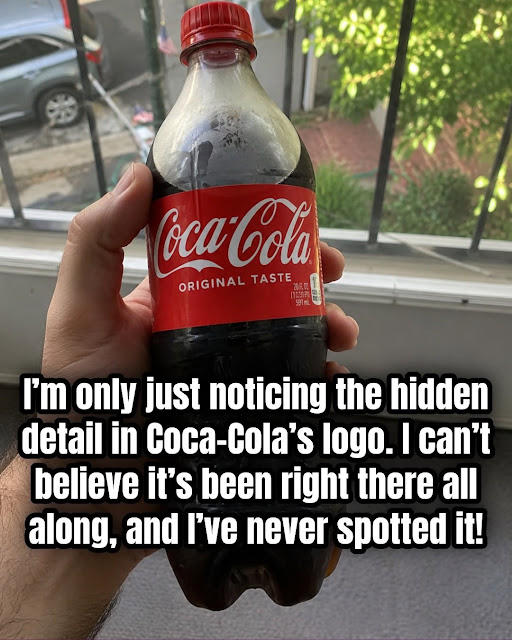
This is where perception comes into play.
Human beings are naturally good at finding familiar patterns and expressions in shapes. A curved line can look like a smile, a pair of shapes can resemble eyes, and an arrangement of ordinary objects can suddenly appear to form a face.
The Coca-Cola lettering contains plenty of sweeping curves and rounded forms, so it’s not surprising that someone might interpret one of those curves as a smile.
There’s also a psychological reason the interpretation feels convincing: we already associate Coca-Cola with positive emotions because of decades of advertising built around happiness, friendship, refreshment, and shared experiences.
When you already expect a brand to represent enjoyment, a shape that resembles a smile can seem especially meaningful.
But Was the Smile Intentional?
This is where it’s important to separate history from internet speculation.
Coca-Cola’s own historical material explains the origins of the wordmark and identifies Robinson’s use of Spencerian script. It does not identify a hidden smile as part of the original design concept.
That doesn’t prove that nobody involved with the design ever noticed the resemblance.
It simply means there isn’t solid evidence that the curve was deliberately created as a secret smiling symbol.
In other words:
You can see a smile in the logo, but there’s no good historical evidence that the logo was designed around a hidden smile.
The Logo Has Changed More Than You Might Think
Although the Coca-Cola script feels almost timeless, the logo hasn’t remained completely identical throughout its history.
The company experimented with different versions and decorative treatments during its early years. Historical examples show variations in the lettering and surrounding design before the familiar form became more established.
Coca-Cola’s official trademark chronology also documents changes to the wordmark over the decades, while noting that the distinctive flowing script has remained central to the brand.
That’s an impressive example of consistent branding.
Many companies completely redesign their logos every few years. Coca-Cola, by contrast, has been able to make adjustments while retaining the essential character of its original script.
What About the Famous Red Color?
Continue reading on the next page →