

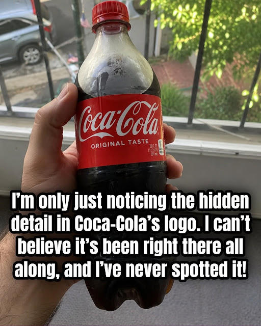
Another detail people often associate with the logo is its unmistakable red-and-white color combination.
Interestingly, the red wasn’t necessarily part of the original wordmark in the way we think of it today.
Coca-Cola’s history explains that Frank Robinson used red lettering with white backgrounds in early signage, helping establish the association between the brand and the color. Over time, red became deeply connected with Coca-Cola’s identity.
The famous Dynamic Ribbon Device, meanwhile, arrived much later, in 1969. It became another recognizable component of Coca-Cola’s visual branding rather than part of Robinson’s original 19th-century wordmark.
Why the Logo Has Been So Successful
The Coca-Cola logo demonstrates something important about effective branding: recognition doesn’t always require complexity.
The design uses:
- Distinctive lettering
- Strong visual rhythm
- Dramatic curves
- Consistent proportions
- A memorable color association
- A recognizable wordmark
Even when the surrounding advertising, packaging, and visual trends change, those fundamental characteristics help people identify the brand.
That’s one reason the logo has remained so recognizable across generations.
The “Hidden Detail” May Say More About Us Than the Logo
Perhaps the most fascinating part of the viral smile theory isn’t whether the designer intended it.
It’s how quickly people begin seeing something once someone points it out.
Before hearing the theory, you might simply see two words written in decorative script.
After someone says, “Look at that curve—it looks like a smile,” your brain may immediately pick it out.
And once you’ve noticed it, it’s difficult to stop seeing it.
That doesn’t make the interpretation meaningless. It simply means the meaning may come from the viewer rather than the original designer.
Frequently Asked Questions
Continue reading on the next page →